Menu Matters: Quick Guide To Creating An Online Ordering Menu That You Can Taste With Your Eyes
In the exciting world of food and online ordering, your menu is more than just a list of what's to eat - it's the first taste of your kitchen's magic. As a savvy business owner in this industry, you know that a great menu catches the eye before the stomach and we’ve created a simple guide to help you make your online menu not just good-looking, but a real treat for the senses. We'll turn your menu into an experience that gets everyone excited about your food!
Organize Your Menu:
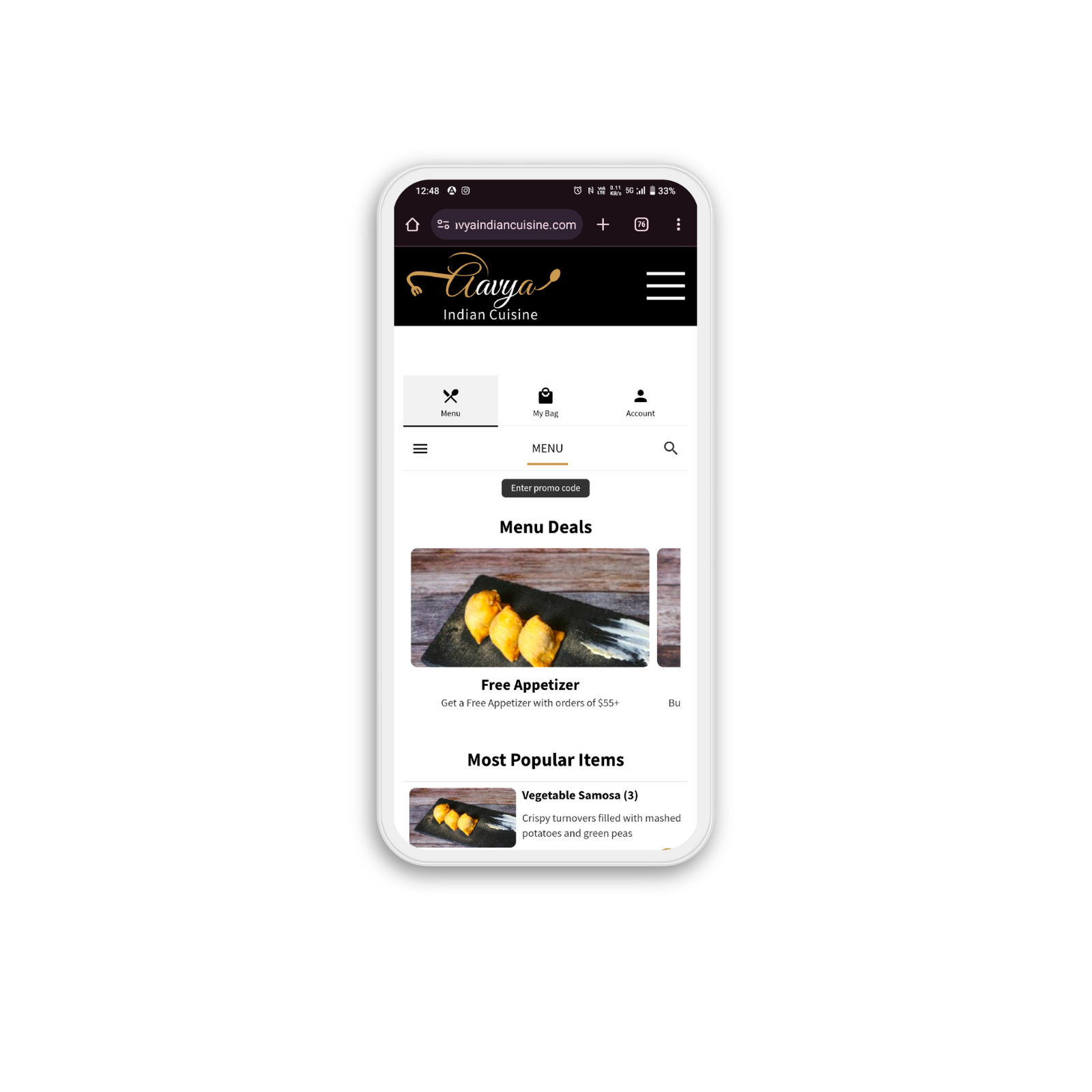
Discounts Attract: Place your irresistible offers and discounts right at the top to attract those hungry eyes and encourage quick conversions.
Swift Navigation: Make it easy for customers to locate and switch between different sections by placing all categories upfront.
Engaging Categories: Help your customers make quick choices by adding categories like popular items and recommended dishes. Learn more about smart menu categories for restaurants.
Lay It Out Well:
Mouthwatering Imagery: Accompany each item with a tantalizing image, giving a virtual taste of what's to come.
Vivid Descriptions: Paint a picture with words. Craft descriptions that let customers savor the flavors before they even order. And don’t forget to add nutritional information—your health-concious customer will love it! See how it works >
Highlight the Stars: Feature your most popular dishes upfront, using eye-catching visuals to draw attention.
Picture-perfect Imagery:
Theme Harmony: Create visual harmony by giving all your images a consistent theme. A cohesive look and feel make your menu visually appealing and memorable.
Focus Matters: Keep the focus where it belongs – on the food. Opt for images that showcase your culinary creations without distracting backgrounds.
Image Quality: Use high-resolution images of uniform size for clarity and a professional look.
Fonts and Colors:
Background Brilliance: A light background, like classic white, makes text and images stand out.
Contrast is Key: Dark or contrasting fonts ensure readability without straining the eyes. Balance is essential for visual comfort.
Readable Fonts: Select fonts that are easy to read at a glance, avoiding overly stylized choices.
Final Touches:
Keep your menu updated with seasonal items and special offers.
Consider customer feedback to refine and improve your menu regularly.
Ensure your menu is mobile-friendly, as most online orders come from mobile devices.
Enable AI upsell and Cart upsell to auto-ecommend customers who are ordering online. Learn more
And, if you are serving Pizza, serve it better with advanced Pizza Modifiers!
Your online menu is more than a list; it's an invitation to a delightful culinary journey. With these tips, create a menu that not only looks great but also tells the story of your food, enticing customers to embark on a taste adventure with every click.


